This is a data visualization exercise showing how to produce a chloropleth map with GDP per capita data for each US state.
Recently, I saw an infographic showing the GDP by state. It looked something like this:
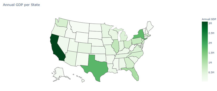
It came as no surprise that California, Texas and New York were the top three contributors to national GDP. The article also stated that California contributed more to national GDP than its share of the population would indicate, but it did not include any more information on per capita GDP by state.
My Python homework problem was this: Compute and display GDP per capita for each US state.
Where’s the data:
- GDP data is available at the Bureau of Economic Analysis, and the dataset (an Excel workbook with multiple worksheet) that is available for download there has GDP by state.
- Population by US state can be found on Wikipedia. Since this is a webpage, you need to use one of two pandas functions,
read_htmlorread_clipboard, to load the data into a DataFrame. See the article on Towards Data Science for more on these two functions. The first function did not import all of the columns correctly, but the ones I needed were usable.
Visualizing data: I included a minimal amount of code to generate a chloropleth map. The map below shows the percentage that each state’s per capita GDP is above or below the national average. At some future date I will add annotations to the map.
